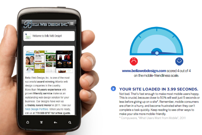
Lately, as I’ve met with many potential clients, this question has come up a lot. I predict in 2012 most companies will move toward creating a mobile version in order to give their “on the go” viewers a better experience. Here is what your developer should and shouldn’t do to make your site mobile friendly:

- Do NOT build any part of your site in Flash. Flash is an outdated animation software created by Adobe. It not only doesn’t work on iPads and iPhones, it doesn’t work on Google. Yes, you read that right. If you use the new Google Instant Previews and you look at sites that have Flash, the boxes with the animation don’t show up. (More here. http://bit.ly/hQS3Al) If your entire site is done in Flash, including the navigation, you’re pretty much a goner.
- Keep it simple and don’t add too many buttons or choices on the home page. Don’t make your site is too complicated to navigate or use large images. The simpler the better. The faster it loads the better. Small buttons can be hard to navigate with large fingers on mobile devices. 60% of people expect the site to load in 3 seconds or less!
- Your phone number should never be a graphic or picture throughout the site. You really want to make sure that you put your number on your site as text so people can click on it on any device and call you immediately like this one (which happens to be ours!) 770 509 8797.
- Look for a mobile theme (or plugin if you use something like WordPress). There are many out there which will plug right into your current theme and make updates easily synch between the regular and mobile site. You can also build a standalone mobile site using WordPress or many other types of content management systems.
There are some good reasons for building an “m.yoursite.com.” Here are a few:
- Portions of your site give critical data to users such as news, schedules, events. These would definitely work in a stripped down mobile environment.
- You sell online. Mobile sites are great for helping you sell easily and quickly online. Keep in mind that your branding may not come through well on a stripped down site. Take a look at the Ebay site example in this post. You can see the www. site version on the iphone looks much more inviting than its m. partner.
- Your competition is already there. 40% have turned to a competitors site after a bad mobile experience with a regular site.
- Your site revolves around social networking, is an application itself, or is a blog. If people are using your site to perform a task or read your articles only, you might want to consider a mobile version.
- Bonus Question: Should I build a mobile site or mobile application? I would go for the mobile site because people will mostly likely use a search engine on their phone to find it. Applications can only be found in the iTunes App store or Android store, not using Google. Also, don’t just build an app because you think it would be “cool.” People expect applications to entertain, teach, create a shortcut or perform a task. If yours does none of these, don’t do it.
The nice thing is technology provides us with choices. There is a way to make “smart sites.” The site itself can detect if its being seen on a mobile platform and can conform to the stripped down version. However, I like giving the reader a choice between the online site and the mobile version. Only you can decide if its worth the extra money to create a second platform for your site, but you might want to do some research of your users beforehand to determine if they will really use it. Think about your potential clients and where they would most likely surf the web. Ask yourself, will people actually use their phone to find me? Something to think about–there will be one mobile device for every person on Earth by 2015. Time for you to get in their pocket.


