In the second part of our series on converting website visitors into customers, we’re taking a look at how visitors are accessing your site — and what that means
Web design used to be solely for big screen, desktop devices. So designers developed strategies that looked great on them, offered voluminous content and took advantage of the visual space and easy viewing.
Today, desktop devices are being outsold by mobile devices. Sales of PCs were down in 2012 for the first time. The majority of cell phones are now smartphones that include capable web browsers, and tablet sales will probably hit 100 million in 2013.
Design Difficulties
Web traffic is moving from the desktop and laptop to mobile devices rapidly. This creates problems for web designers, including:
- Smaller screens can’t display as much viewable information.
- Web design must suit the device they’re viewed on — or visitors bail.
- Not all devices support all web technologies. For example, Apple doesn’t support Adobe Flash, complicating web design issues and leading to content that doesn’t display properly.
- Device-specific apps and websites are great, but the massive variety of current devices means that designing individual apps to suit all environments — from iPhone to Android phones, not to mention tablets — isn’t cost-effective.
A Solution: Responsive Web Design
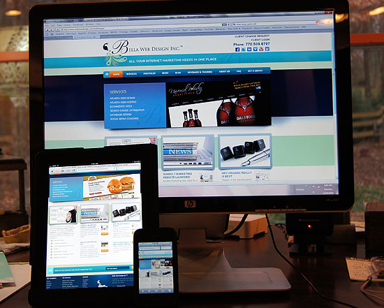
Responsive Web Design automatically adapts to the device the visitor is using, altering the information and features of the website to suit the resolution and capabilities of its screen and web browser. This rapidly-growing strategy uses numerous methods to customize websites for the growing array of display options.
For example, when a user lands, the site uses a media query to determine the screen resolution, the browser and device type, and other information.
Based on the results, the website adapts to the device and provides suitable content. Multi-column layouts shrink to fewer columns as screen width goes down, and some features, graphics, tools and other content may be dropped as needed. The smaller the screen, the less that is displayed.
Further, if the device can’t properly display, say, a Flash animation, it simply won’t appear. On larger displays with higher resolutions, more information appears. This meshes well with how devices are typically used. Desktop and notebook users tend to linger over content, while those using handheld devices typically spend less time on individual web pages.
Scale Up, Not Down
Responsive Web Design often works best when pages are designed to expand, rather than contract. That’s just the opposite of how things have worked in the past. By thinking about the smallest screens and lowest resolutions first, then adding features and capabilities as resolutions increase, it’s often easier to maintain the website’s focus and balance at all screen resolutions.
As we continue to move toward smaller, handheld devices, time is short to begin accommodating their users with the information they need about your company. Your competition isn’t waiting. (We include a mobile design in all of our custom site packages–hint, hint!)