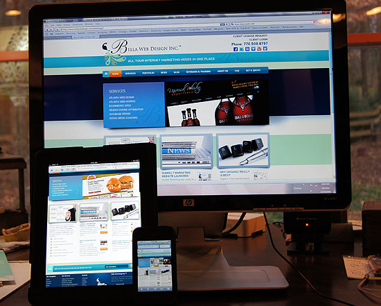
As I was reading an article this morning on my iPad a ZDNet article popped up about “Record iPhone/iPad/Mac Sales for Apple in Q1.” Over 24 million iPhone and iPad devices were sold this Christmas. That’s more than 46 million iPhones sold in 2010 alone and iPad sales are expected to more than double this year. Based on this information and watching the popularity of the iPad when it was launched, we realized a long time ago designing websites that worked on these devices is critical. If you’re talking with other web firms, make sure they are following the same rules we’ve put in place. If they aren’t addressing the subject of ensuring web compatibility for your site, you might want to think twice. (The best test of this is to see how their own sites and portfolios look on an iPad/iPhone. You’ll know quickly if they are even thinking about this if they haven’t even taken the time to make their own sites web compatible.) Here is what we follow as our guidelines:
Flash is Dead (until they reinvent it). Flash is no longer considered a web compliant medium. If you have flash on your site, the iPad and iPhone will not show it. You’ll end up with a site that has empty space where the animation should be. Worse, if your whole site is in Flash, it will be completely invisible and no navigation will render the site useless. Flash also doesn’t work on Google Instant Previews where you can see a site’s design in the results before you go to it. All you see is empty space.
Websites Designed Like Applications. This is already happening to sites you visit on a regular basis. Look at Twitter’s recent major design transformation on an iPad or iPhone and you’ll see what I mean. The whole site looks like an application and is even better than it’s official iPad app, in my opinion. On the other hand, apps are designed more like the websites they represent. It’s all a matter of branding. Branding should be consistent including colors, logos and layout between both an app and its website.
Navigation is Widgetized. If you look at an iPad application, you know exactly which buttons to push to get to where you need to go. Same with websites being designed to work on these platforms. There are more sections of information with larger buttons to get you where you need to go on websites which are iPad compliant. No more little text links to deal with which are hard to navigate with large fingers.
Video is Sexy, Images are Beautiful. Site owners are investing in tools which will enable them to create HD video and images to set their site apart from the pack. Everyone knows it’s the images that really make a website shine. If your images are blurred, don’t kill your chances of making a good impression. Delete ‘em! Video will also continue to make strides on sites as it is a natural on the iPad and iPhone. A professional video on your site will impress more visitors than just plain text. If you can speak the words, why not videotape them being spoken by a company representative, or better yet, the owner? It will make a much more lasting impression.
Fluid Width Design. The iPad has no RIGHT way of viewing websites. That means you can view it either in landscape or in the portrait mode. But for the designer that means two completely different layouts for which to design. It is for this specific reason that the iPad highlights the need for smart fluid width design.
So my question to you is, have you viewed your site on an iPad or iPhone yet? Are you afraid to see what you might find? I would encourage those who don’t own these devices to go to the Apple store and take a look. If your own site doesn’t represent your company well on all popular platforms, you might think about hiring someone who can can change that. (You might also look into creating an application that can further help your customers, but that’s another blog post forthcoming. Stay tuned!)
